A different type of crossover.
Fanatics are launching a fresh collection of “Football x Football” jerseys – a creative crossover that reimagines all 32 NFL teams with designs inspired by classic soccer kits.
As with any bold jersey drop, opinions will vary wildly. But here is my personal top 10 – and bottom 10 – from the collection.
Honourable mentions
Shout out to the Patriots and Colts for channelling their inner AC and Inter Milan respectively.
Also credit to the Jets for the Celtic-inspired effort – not quite top 10, but a good kit nonetheless.
Let us start with the worst — in reverse order.
10. Los Angeles Chargers
Probably the best uniform set in the NFL already, so thankfully Chargers fans, you do not need to bother with this. We get it. Lightning bolts.
9. Carolina Panthers
Look – I love a blackout kit. But this one? Panthers fans, you have been short-changed. That electric blue and silver could have popped on this. Instead, it is just… flat.
8. Las Vegas Raiders
I feel like if they had flipped the colours, this could have looked pretty sharp. As it stands? Too much silver, not enough contrast.
7. Houston Texans
Not awful, just totally uninspired. Steel blue and battle red is a decent combo – so why does this feel like they gave up halfway through?
6. Jacksonville Jaguars
Jags fans might love it – I can see the appeal. But to me, that Jaguar print looks like someone spilled water on a black t-shirt!
5. Baltimore Ravens
The pattern just does not work for me. Needs more of that signature metallic gold – the one thing that usually makes Ravens gear shine.
4. Tennessee Titans
I have never liked fade effects on kits. With colours this strong, how did they make something so… meh?
3. Seattle Seahawks
This might be on me. I have never clicked with Seattle’s colour scheme. I think a throwback vibe would have hit harder. This? It just does not land.
2. Atlanta Falcons
Just… why? Red and black is a timeless combo – this somehow manages to make it look like something you would find in a pre-school art session. Sorry, Falcons.
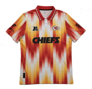
1. Kansas City Chiefs
No. Stop it. You could send this back to the 1980s and they would still throw it out. A full reset needed here.

And now… my favourites, in reverse order.
10. Minnesota Vikings
The Nordic rune detailing is chef’s kiss. Clean, clever, and on brand. Vikings fans will be all over it.
9. Green Bay Packers
Pinstripes. That crisp collar. That iconic green and gold (no bias, I promise). Just classic.
8. Detroit Lions
This one pops. The central stripes are sharp – and while I expected more Honolulu blue and silver, the restraint here actually works. Really tidy.
7. Arizona Cardinals
Now this is how you do red and black. The sleeve detailing brings it to life. One of the boldest looks in the set.
6. Cincinnati Bengals
Much like their regular uniforms – this just works. The orange is vibrant, the subtle Bengal print is a classy touch. Very nicely done.
5. Dallas Cowboys
Some will say it is plain. I say it is clean. Sleek, timeless, unmistakably Dallas.
4. Washington Commanders
A really strong showing. The pattern is understated but effective, and the whole thing feels modern without trying too hard.
3. Miami Dolphins
Smart. Clean. That subtle pattern? Lovely. Aqua and orange is always a winning combo, and it shines here.
2. Los Angeles Rams
Excellent use of their palette – and the horn pattern integrated into the fabric is a masterstroke. Unique without being over-designed.
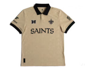
1. New Orleans Saints
The collar. The black and gold. The fleur-de-lis scattered across the shirt like royal confetti. A regal beauty. Chef’s kiss.

Let us know your favourite and least favourite designs in the comments below or on our social media sites.
You can check out the full rankings over @JoinTheHuddleUK.


